
General
– Also called Spectrograph
– a traditional Waveform is Displayed in 2D with Amplitude (Vertical) and Time (Horizontal)
– but a 3D Spectrogram Shows Frequency in the Vertical Display, Amplitude as Height in 3D with Variable Brightness and Time Horizontal
– Variable Brightness means, the Brighter the Display the Louder the Content
– X-Axis = Time (Like in a Waveform), e.g. How Speeches Changes
– this allows us to See when the Sound happens, what Harmonics are Present and How Strong they are
– Y Axis = Frequency (Like in a Spectrum), e.g. e.g. See How Frequency Changes in a Speech Sound
– Darkness = a 3rd Dimension Showing Amplitude on a dB Scale (Like Vertical Axis on a Spectrum), Some Spectrograms Use Color (Instead Darkness) to Show Amplitude
Example
– Example of a Waveform Display vs Spectrogram Display (Showing 2 Seconds of a Speech)
– i.e. Spectrogram Shows Low to High Frequency from Bottom to Top, Time from Left to Right, Darker Parts Represent High Amplitude (Almost Black) Whereas Light Grey or Almost White is Low Amplitude
– thus at Around 0.5 Seconds and 3500Hz the Amplitude is Almost Black Telling us Especially at 3500Hz the Amplitude is High,
– Viceversa at Around 0.5 Seconds and 1200Hz the Amplitude is Almost White Telling us Especially at 1200Hz the Amplitude is Very Low (Almost Silence)
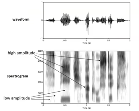
– so with a Spectrogram you can Interpret What Frequency in a Sound has the Highest Amplitude, What the Highest or Lowest Frequency is, What Frequency has the Longest Duration
– e.g. also in the RX Spectrogram Y (Bottom to Top) = Frequency, X (Left to Right) = Time, 2D Variable Brightness Show Frequency Activity, while the 3D Spectrogram the Amplitude is Displayed as Height (Dynamics) Plus it Changes the Color Intensity Based on Frequency Activity
Leave a Reply